Learn How to Solve Graphs Questions in Numerical Tests

If you’ve been asked to take a pre-employment psychometric exam, chances are likely you’re going to have to deal with graphs. Whether you’re a graduate applying for a position in the sales department of a business or you’re a top professional analyzing financial trends on the stock market online, you’ll need to know how to use graph reasoning.
Below, we’ll discuss three of the trickiest graphs according to job-seekers: area graphs, radar graphs, and HLC/OHLC graphs. We’ve even included some screening questions to help get you started.
Area Graphs:
We choose to display information differently according to what effect we want to achieve. That is to say that while the data will still be the same data regardless of how it’s presented, choosing to plot that data in a line graph vs. a bar graph will affect the audience differently.
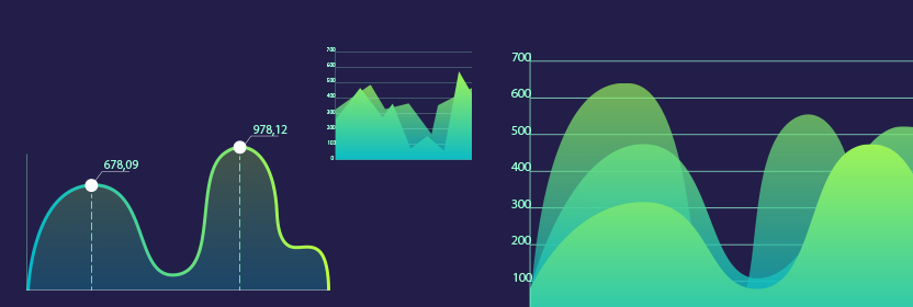
Researchers generally choose a line graph if they want to show how a value or amount has changed over time. On the other hand, they’ll use a bar graph to easily compare data in different categories. An area graph is essentially a combination of a line and a bar graph. Because each of the sections of the graph are colored in, area graphs emphasize the movement of the trend overall rather than just the juxtaposition of the individual data points.
An area graph can either be stacked or non-stacked. On a stacked area graph, you’ll be able to see how each section contributes to the whole. Each of the sections will be clearly marked and separated. You might use this graph to measure how the sales of several different products contributed to overall sales.

On a non-stacked graph, by contrast, all of the data points will overlap. This type of graph is a bit difficult to read, but it’s perfect for comparing different trends.
Question #1: What were the total sales in February for all four of the chain stores?
Radar Graphs:
Radar charts are probably the most confusing type of graph because of their spider web shape. On a radar chart, each of the lines that extends from the center serves as an axis. Each axis represents a different variable. The data for each variable is plotted on the respective axis, and the points are then all connected.
Radar graphs typically serve two functions. Firstly, they show whether there are any outliers. Radar graphs can track multiple variables, and it becomes glaringly obvious if one of the data points is far away from the others. These charts can also help researchers compare the variables and judge overall performance.

Question #2: For which skill is there the greatest difference in mastery between Tom and Susan?
HLC/OHLC Graphs:
HLC and OHLC graphs, high-low-close and open-high-low-close graphs, are designed to help map out prices of shares sold on the stock market.
There are several different ways you can create an HLC/OHLC graph, but they’ll all share a few characteristics. They all label, essentially, where the price of a stock opened and where it closed as well as the high and low points. The length of the bar essentially shows investors how volatile the market is. Just make sure that you look carefully at the legend before you attempt to read the graph.

Question #3: On which day was the market more volatile: January 24th or March 6th?
Numerical Graph Tips:
Before heading into the assessment center to take your graph aptitude test, make sure to read up on our best tips.
- Always make sure you note the scale on the graph. The scale on the graph may be in 10’s, 100’s, or even 1000’s of units. This could drastically change your response to a question.
- Double check to see what each axis actually measures.
- Glance at the legend if there is one to see whether this graph differs from other ones you have seen.
Answers:
- ~$52,000
- Communication
- January 24th


